Behind the Scenes of the Bitters & Bones Rebranding Project
For my Bachelor of Fine Arts in Graphic Design, we had a rebranding project that used a real local restaurant and bar: Bitters & Bones for our test subject. Located in the beautiful Adirondack Mountains, this spot has a welcoming, family-friendly atmosphere that I wanted to reflect in my designs.
Finding Inspiration in the Adirondacks
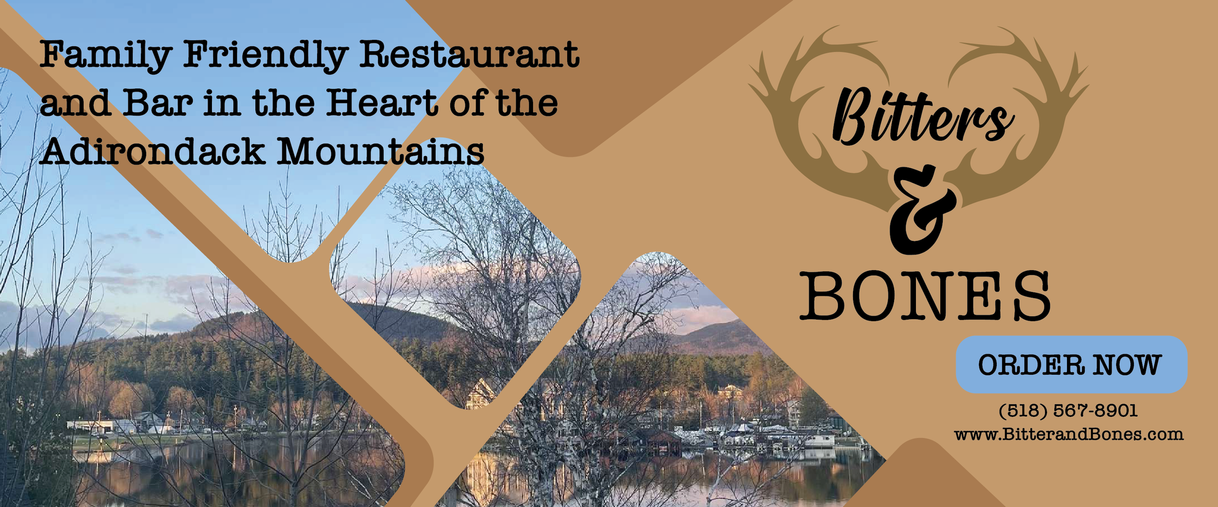
Living in the Adirondacks, I’m inspired by the natural beauty and rustic charm that surrounds me. For this project, I incorporated elements like antlers and earthy tones to capture that Adirondack feel. My goal was to create a brand identity that would resonate with both locals and visitors.
Creating the Look
For the rebrand, I focused on a logo that incorporates antlers as a symbol of the Adirondack wilderness, paired with rustic yet clean typography. I designed various brand assets, including a menu, signage, and social media graphics, aiming for a warm and cohesive look that would blend with the restaurant’s vibe.
A Special Project
This project was a meaningful one for me—not only as a design challenge, but as a way to celebrate the Adirondacks, a place I know well and love. Working on Bitters & Bones’ rebrand allowed me to explore how design can enhance and honor a local business.
